2.9K articles
https://nearform.hashnode.dev
By Luke Jones Add pagination to your GraphQL schema without the boilerplate We introduce you to therelay-pagination-directive, a new package from Nearform. This package reduces the boilerplate required to implement cursor-based pagination in GraphQL....
https://jaaniwrites.hashnode.dev
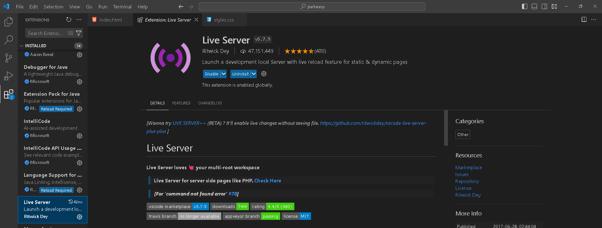
Started Learning HTML and CSS from Youtube YouTube: Install a coding editor like Visual Studio Code. You: Downloads and sets up VS Code. YouTube: Install some extensions, like Live Server by Ritwick Dey. You: Live Server? Okay. But what is a live se...
https://coderoflagos.hashnode.dev
While code completion can significantly boost developer efficiency, there's a crucial factor to consider: accuracy and relevance. There are no doubts that it's made efficiency easier for developers who are trying to make development seamless; so many...
https://arya573.hashnode.dev
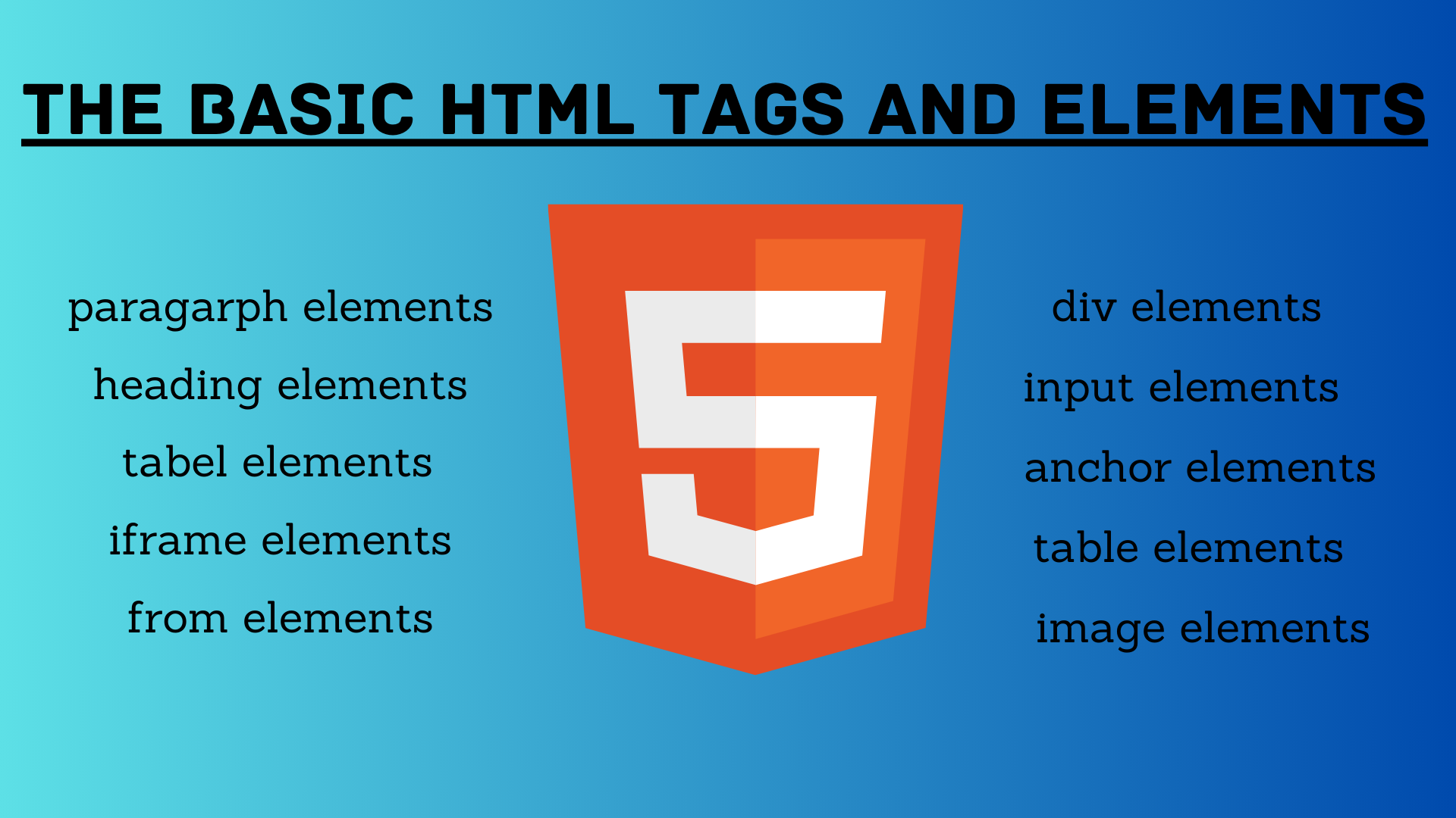
Heading Tag <h1 to h6> This HTML tag can be defined as a title or a subtitle that we want to display on the webpage. It is displayed on the browser in bold format and the size of the text depends on the number of headings. It has six levels <h1 to h6...
By Siddharth Gelera Memory management ensures systems perform as they need to Many businesses and developers opt for JavaScript due to its extensive support across various platforms, including web, mobile, servers, and embedded systems. Understanding...
By Alfonso Graziano and Vikas Bhandari Understanding how the V8 garbage collector works helps improve the performance of a Node.js app Improving the throughput of a Node.js app can be a complex topic, involving code optimisations, architecture change...
By Tiago Ramos Exploring the exciting world of Large Language Models (LLMs) At Nearform, we're always on the lookout for emerging technologies that have the potential to wow our customers and transform their organisations. Just like how we became big...
https://subhash1599.hashnode.dev
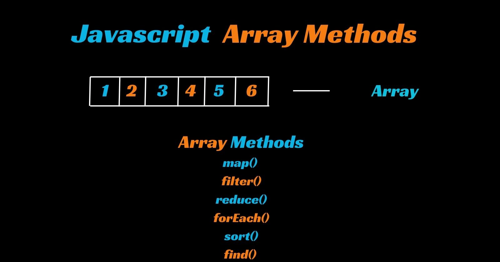
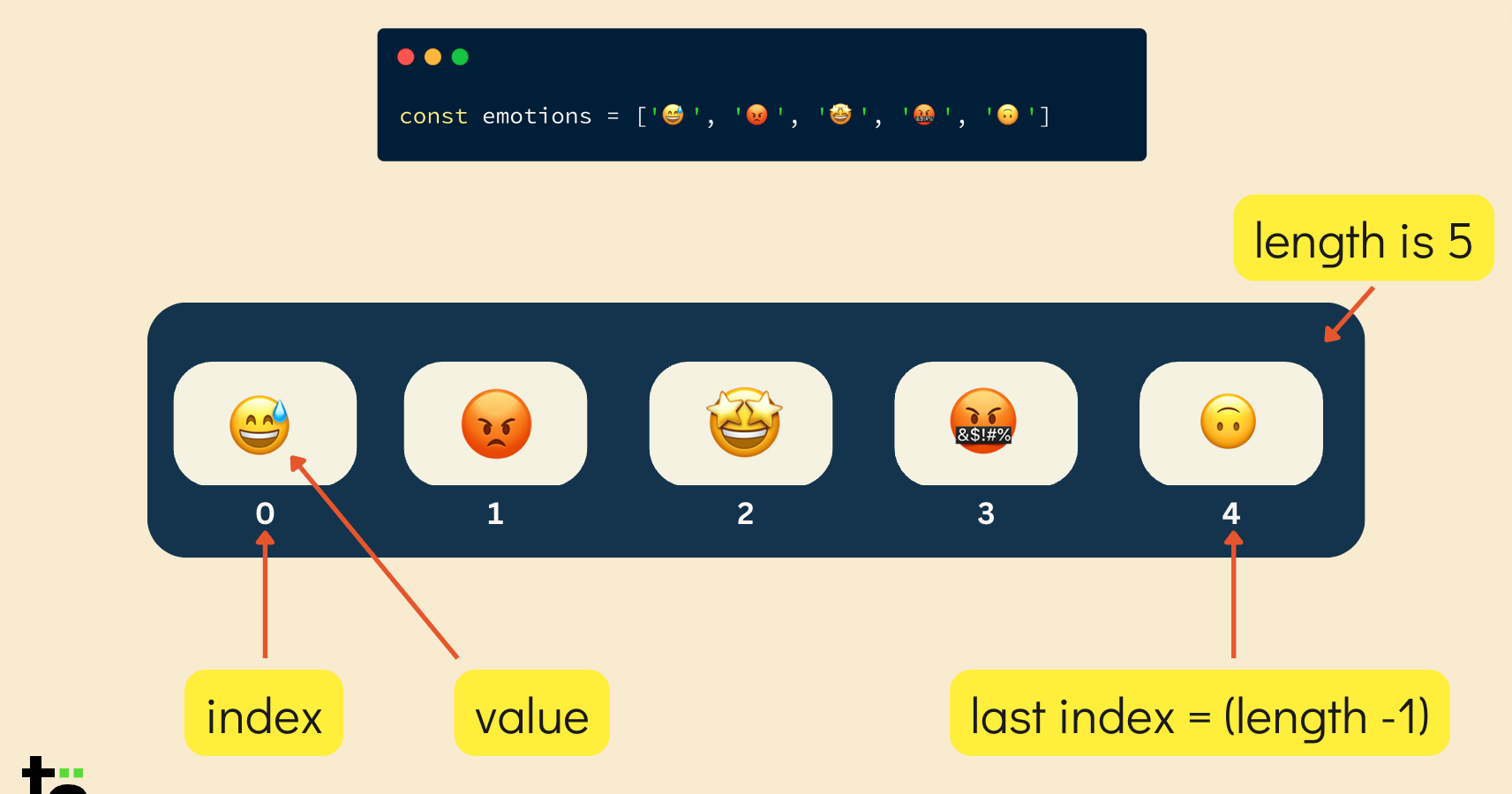
Array It is the collection of elements of different data types. It is of dynamic size. we can access the elements of array by indexes. The index start from 0 to size_of_array - 1. Example: let arr=[1,2,3,"Hello","Hai"] Output: [1,2,3,'Hello','H...
https://pranjali14.hashnode.dev
What is Array??🤔 Generally array is data structure used to store same type of data in a single variable. Arrays can hold various types of data, including numbers, strings, objects, or even other arrays. They are commonly used for tasks such as stori...
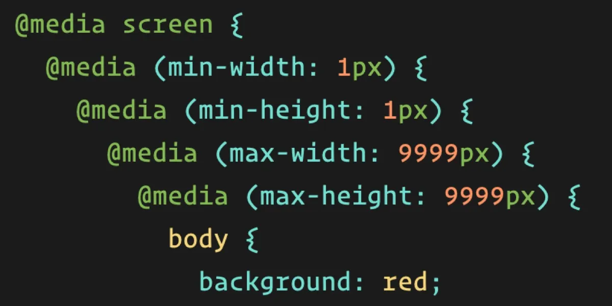
Media queries play a crucial role in responsive web design by enabling developers to create layouts that adapt and respond to the size and capabilities of the device being used to view the website. Why Media queries important ? Media queries are impo...
Follow this tag to get updates directly on your Hashnode feed.