

CSS grid - 1
Let us master the CSS grid layout in an easy-to-understand way!


Hello! In this article let's look at CSS grid layout. I will assume that you have a basic understanding of HTML and CSS.
CSS grid is one of the most powerful and easy to use layout system available in CSS. It shines at dividing the webpage into smaller portions. It is used to design responsive, and flexible layouts. It offers a grid-based layout system with rows and columns.
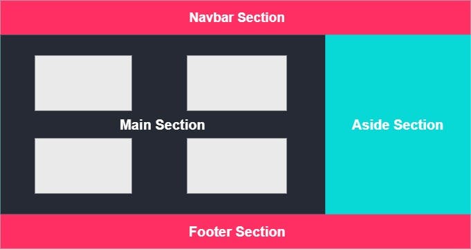 The above picture is a simple webpage displaying basic sections of a website. For a frontend developer to build such a design he/she can make use of positioning properties or flexbox or even floats. Though all these properties are good and strong, they come with their own drawbacks like float property generally requires a clearfix otherwise it may break aspects of the page. Flexbox generally can be used in one direction only. So to overcome some of these issues, we have to learn CSS grid and that is exactly what we will be doing right now.
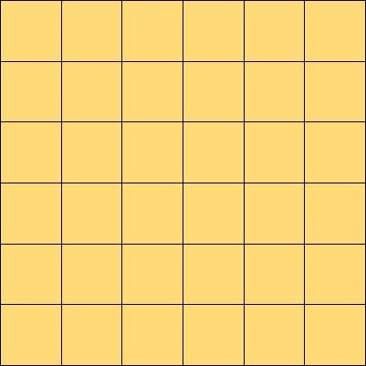 This is how a grid system can be imagined with any number of columns and rows we would want to have.
Let's get into the code part
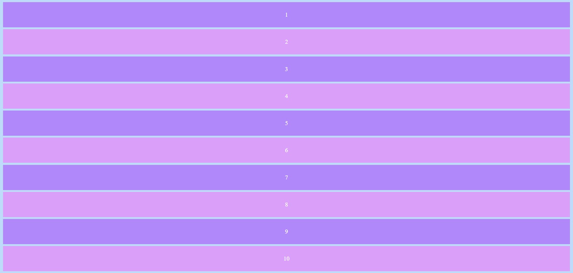
Consider the following HTML and CSS files
<!DOCTYPE html>
<html lang="en">

<head>
    <meta charset="UTF-8">
    <meta http-equiv="X-UA-Compatible" content="IE=edge">
    <meta name="viewport" content="width=device-width, initial-scale=1.0">
    <title>CSS grid</title>
    <link rel="stylesheet" href="styles.css">
</head>

<body>
    <div class="container">
        <div class="box1">1</div>
        <div class="box2">2</div>
        <div class="box3">3</div>
        <div class="box4">4</div>
        <div class="box5">5</div>
        <div class="box6">6</div>
        <div class="box7">7</div>
        <div class="box8">8</div>
        <div class="box9">9</div>
        <div class="box10">10</div>
    </div>
</body>

</html>
body {
  background-color: #bedcfa;
  text-align: center;
  color: #ffffff;
}

.container div {
  max-width: 1500px;
  padding: 24px;
  margin: 5px;
}

.box1,
.box3,
.box5,
.box7,
.box9 {
  background-color: #b088f9;
}

.box2,
.box4,
.box6,
.box8,
.box10 {
  background-color: #da9ff9;
}
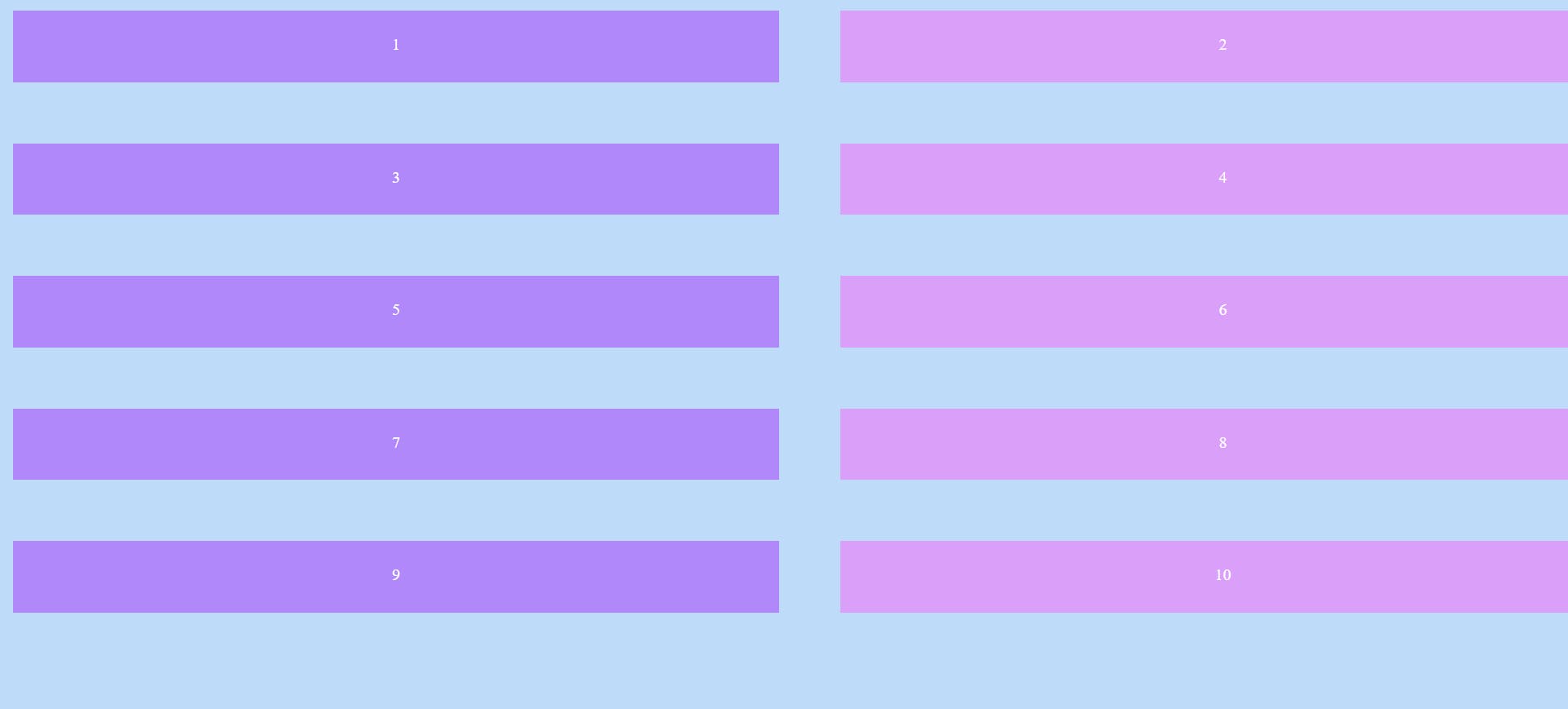
Output :
Display
Setting the display property of the container element to grid establishes a new grid formatting context for its contents.
.container {
  display: grid;
}
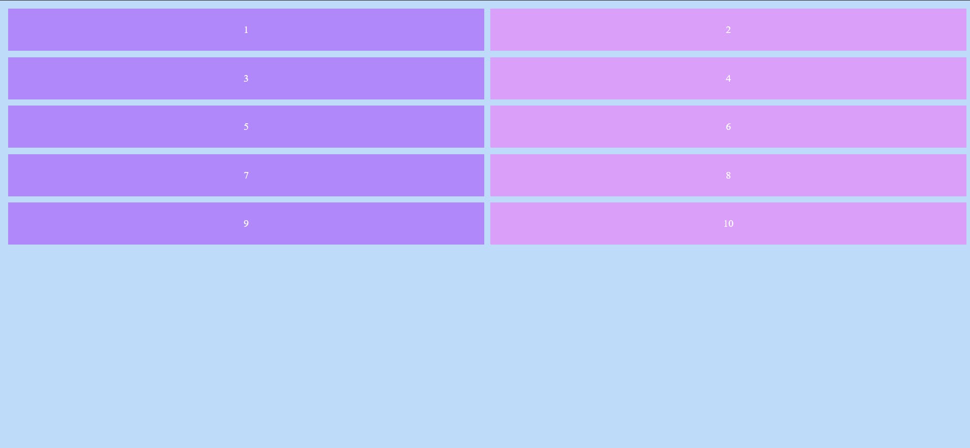
Columns :
grid-template-columns defines the columns of the grid with a list of values that represent the amount of space taken by a particular element
.container {
  display: grid;
  grid-template-columns: 50% 50%;
}
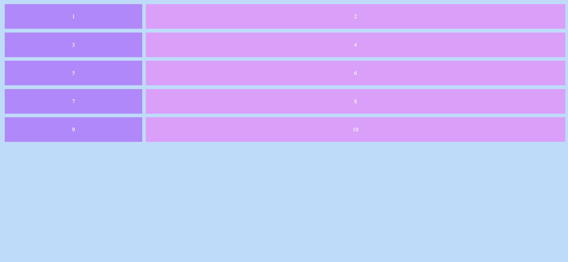
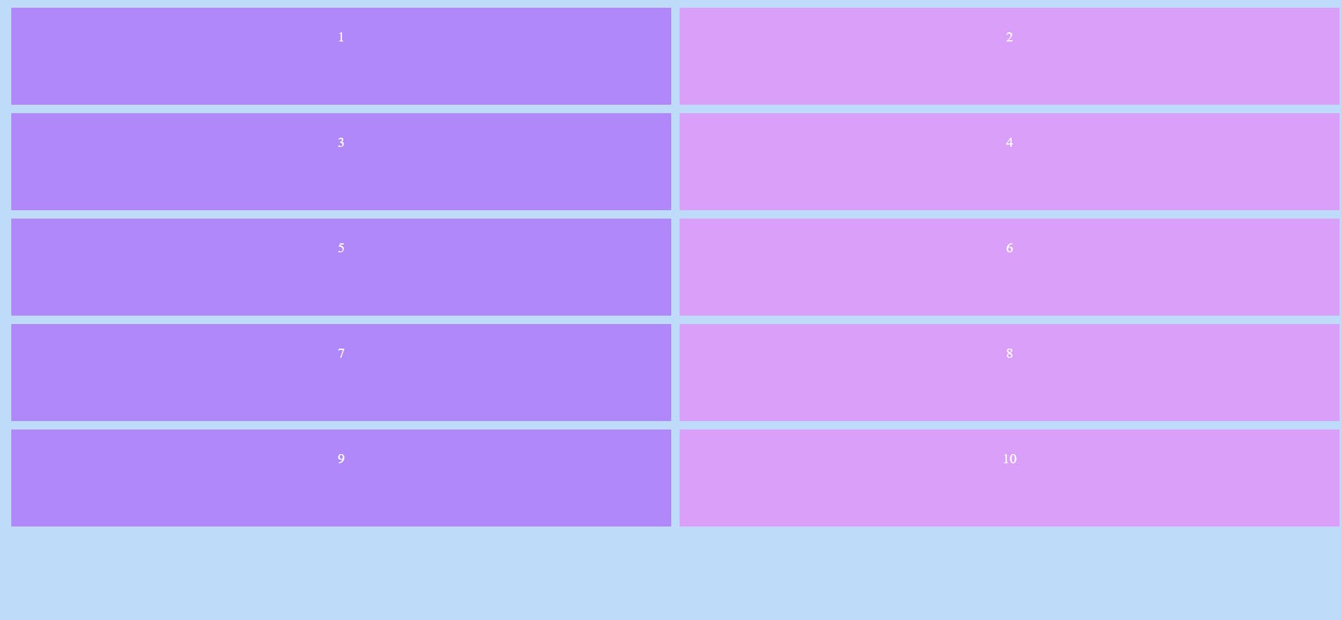
The above code states that two columns must occupy 50% each of the total width
Output :
.container {
  display: grid;
  grid-template-columns: 25% 75%;
}
The first column occupies 25% and the second column occupies 75% of the total width
Output :
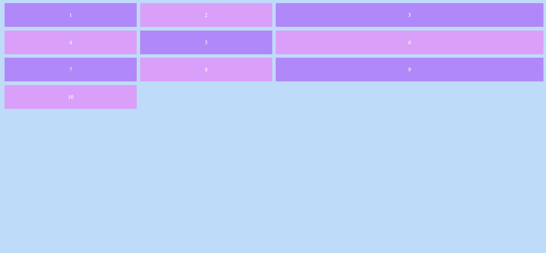
.container {
  display: grid;
  grid-template-columns: 1fr 1fr 2fr;
}
We can mention the number of spaces taken in terms of fractions too. (fr in short)
Output :
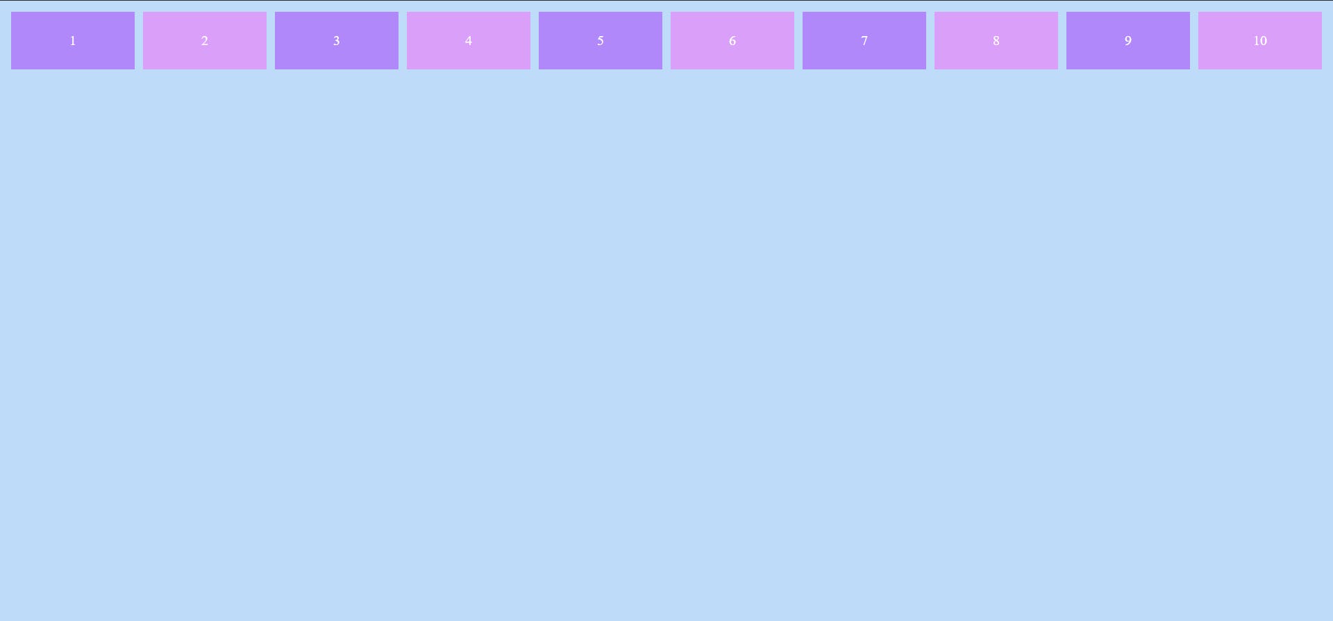
.container {
  display: grid;
  grid-template-columns: repeat(10, 1fr);
}
This code makes ten elements to have a size of 1 fraction
Output :
Rows :
grid-template-rows defines the rows of the grid with a list of values that represent the amount of space taken by a particular element
.container {
  display: grid;
  grid-template-columns: 50% 50%;
  grid-template-rows: 130px 60px 90px 200px 100px;
}
Two columns take equal spaces and hence 5 rows are created. These rows take the sizes 130px, 60px, 90px, 200px and 100px. (px means pixel)
Output :
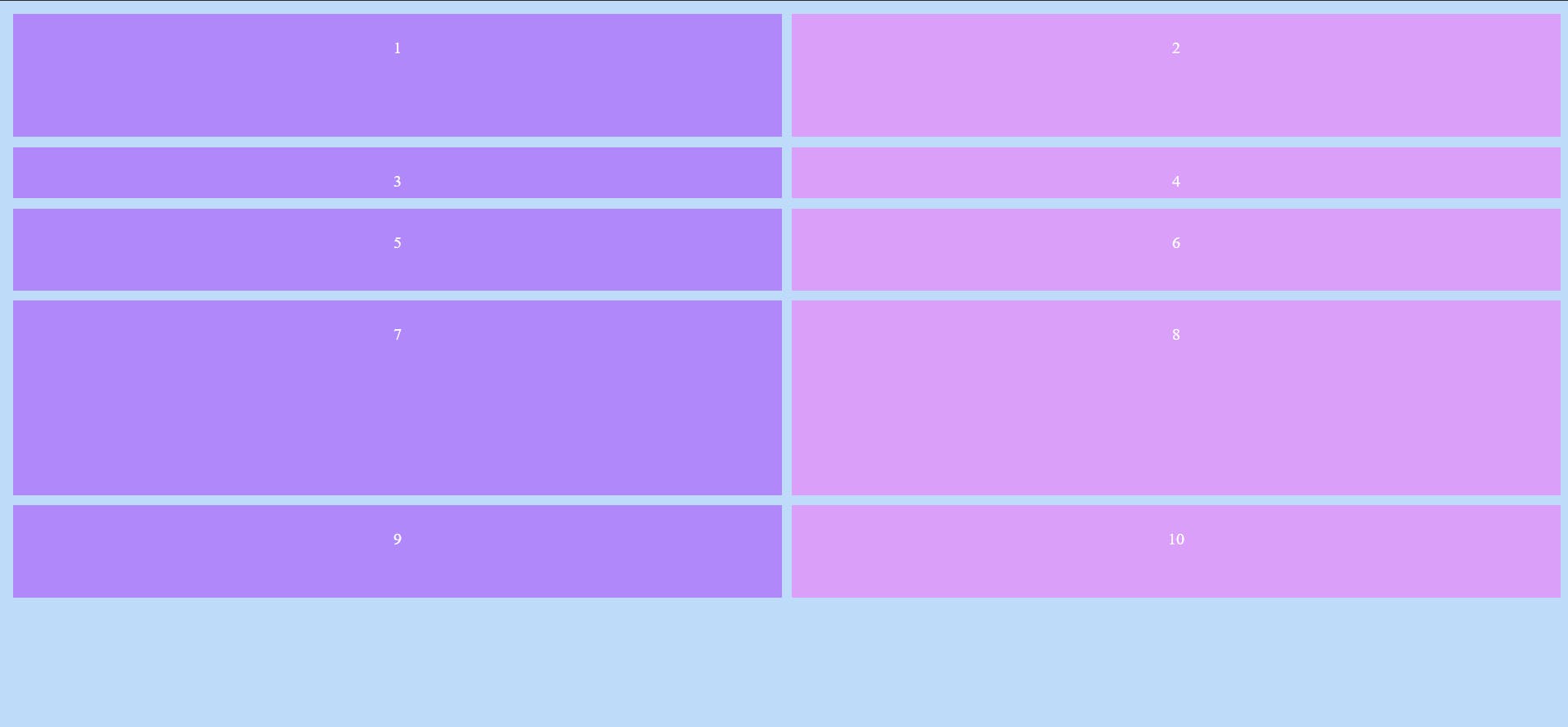
.container {
  display: grid;
  grid-template-columns: 50% 50%;
  grid-template-rows: repeat(5, 120px);
}
Every row takes 120px each
Output :
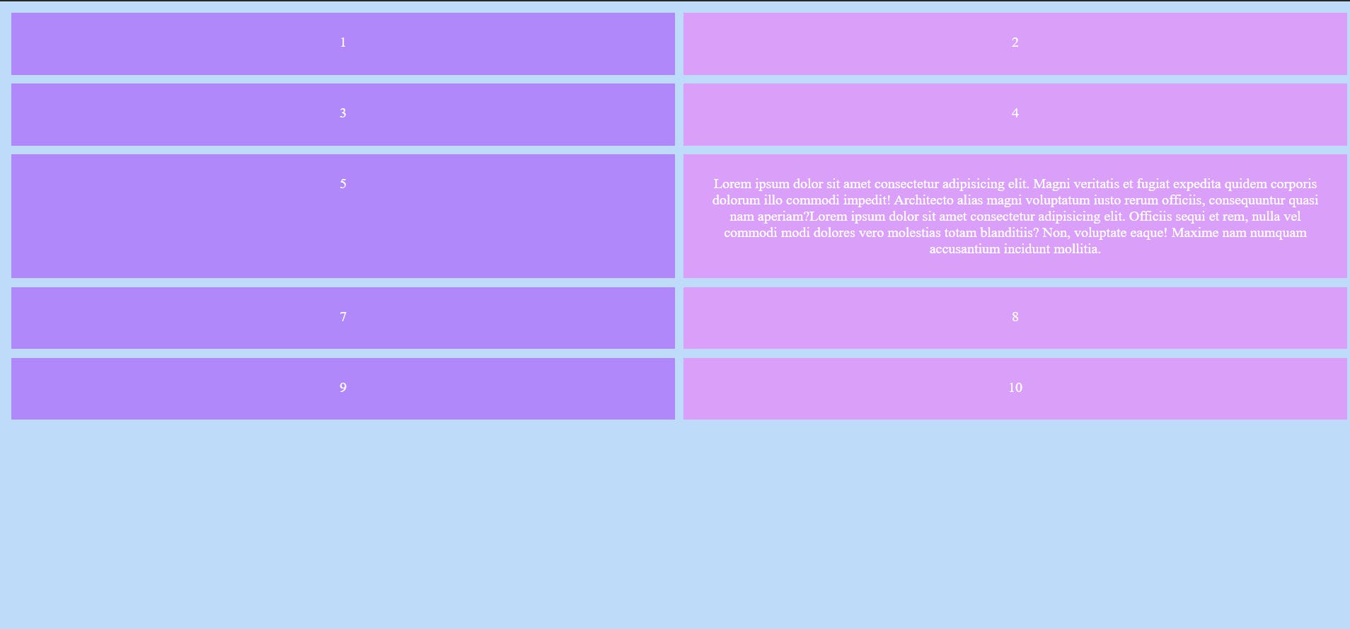
Suppose the containers contain some text, providing the row space could hide some of the content as the provided space could be lesser than what is required. To avoid this, we can make use of minmax() as shown below
.container {
  display: grid;
  grid-template-columns: 50% 50%;
  grid-template-rows: repeat(5, minmax(80px, auto));
}
This makes sure that the minimum space a row should take is 80px. Maximum space is set to auto which makes the row take as much space as required to entirely show the contents.
Output :
Providing spaces between the boxes
We can set additional space in between the boxes other than the margin by making use of the grid-gap property.
.container {
display: grid;
grid-template-columns: 50% 50%;
grid-template-rows: repeat(5, minmax(80px, auto));
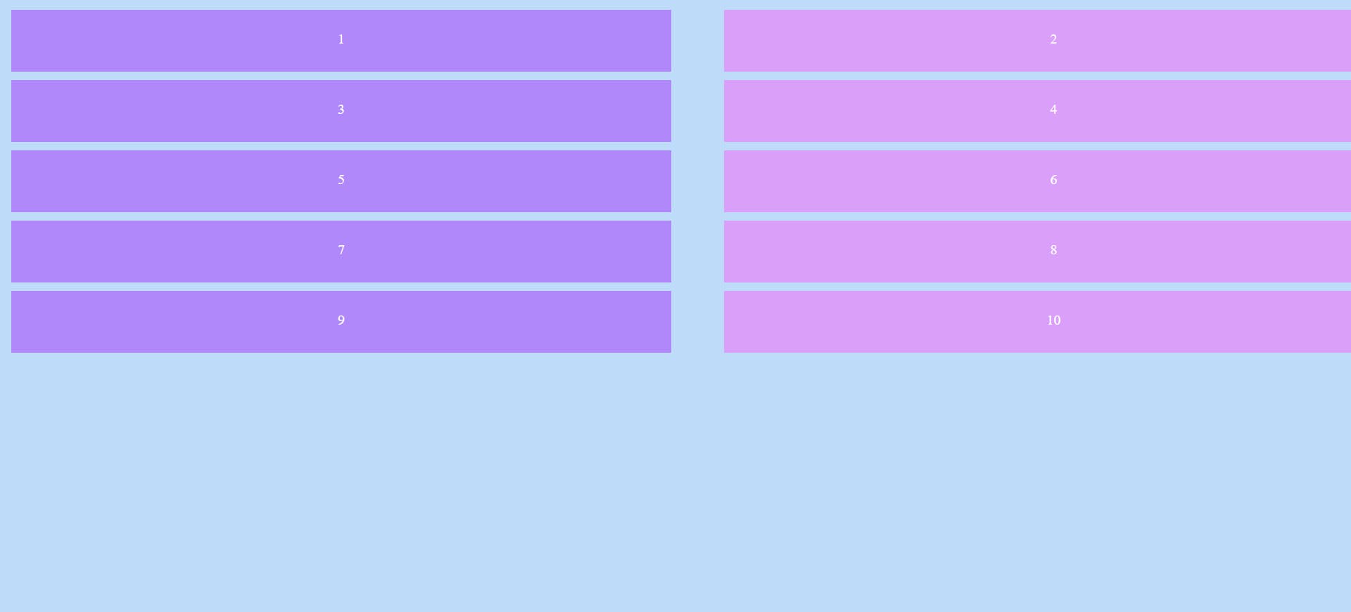
grid-column-gap: 50px;
}
Sets 50px of space between columns only.
Output :
.container {
display: grid;
grid-template-columns: 50% 50%;
grid-template-rows: repeat(5, minmax(80px, auto));
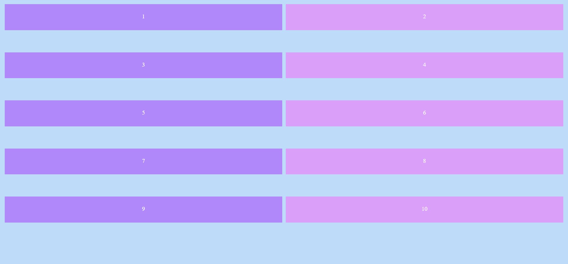
grid-row-gap: 50px;
}
Sets 50px of space between rows only.
Output :
.container {
  display: grid;
  grid-template-columns: 50% 50%;
  grid-template-rows: repeat(5, minmax(80px, auto));
  grid-gap: 50px;
}
Sets 50px of space between both columns and rows.
Output :
That's all for this article. Hope you liked it and learned from it too.
I will continue to post articles based on CSS grids in the future.
Have a great day!