


Hello and welcome back to the CSS grid articles, part 3. I hope you have already gone through the first two parts where I have covered some of the basics.
In this blog, we will look into and understand more of the CSS grid layout system.
Until now, we have only looked at CSS grids in the point of learning them. In this article, we will try to build a real website layout that contains a navbar, main section, footer section, and much more.
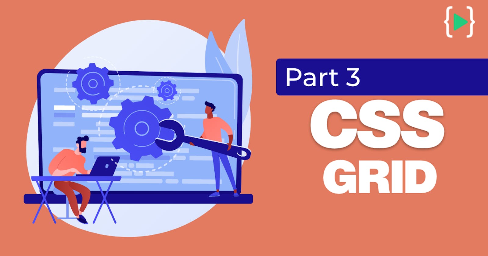
Consider the following basic HTML and CSS files for getting started.
HTML :
<!DOCTYPE html>
<html lang="en">

<head>
    <meta charset="UTF-8">
    <meta http-equiv="X-UA-Compatible" content="IE=edge">
    <meta name="viewport" content="width=device-width, initial-scale=1.0">
    <title>CSS grid</title>
    <link rel="stylesheet" href="styles.css">
</head>

<body>
    <div class="container">
        <div class="nav"></div>
        <div class="main"></div>
        <div class="img1"></div>
        <div class="img2"></div>
        <div class="footer"></div>
    </div>
</body>

</html>
CSS :
body {
  background-color: #eabf9f;
  text-align: center;
}

.container div {
  max-width: 1500px;
  padding: 24px;
  margin: 5px;
  background-color: #1e212d;
}
Output for the above HTML & CSS codes :
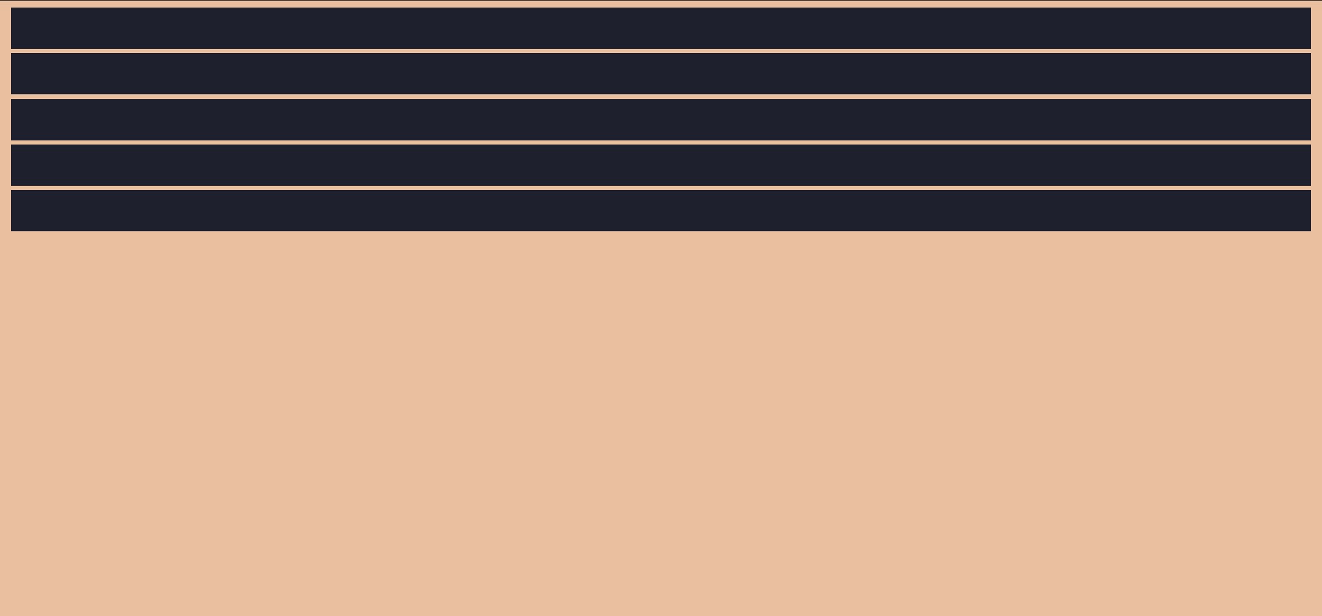
Let's start using some of the grid properties. Once again, please check the first two parts of the CSS grid layout system articles for better understanding.
.container {
  display: grid;
  grid-template-columns: repeat(4, 1fr);
}
Output :
Unlike before, where we used grid-column or grid-row properties to position the elements, we will now be using the grid-area name.
.nav{
  grid-area: nav;
}

.main{
  grid-area: main;
}

.img1{
  grid-area: img1;
}

.img2{
  grid-area: img2;
}

.footer{
  grid-area: footer;
}
In the above code, we assign names to every element of our page. Doing this will help us soon as we go further.
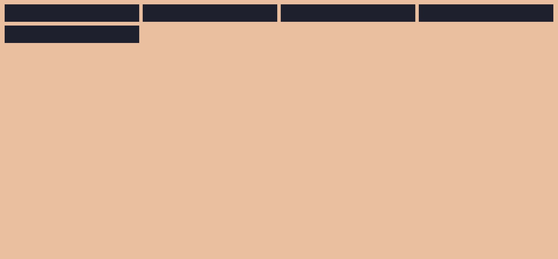
We can now make use of grid-template-areas following its syntax which is shown below:
.container {
  display: grid;
 grid-template-rows: repeat(4, 100px);
  grid-template-rows: repeat(4, 100px);
  grid-template-areas:
    "nav nav nav nav"
    "img1 img1 img2 img2"
    "main main main main"
    "footer footer footer footer";
}
What the above code does is, the first row of our webpage must take four columns of the nav section, the second row must take two columns of image1 and two columns of image2, the third row must take four columns of the main section and finally the fourth row must take four columns of the footer section.
Output :
Make sure you have given enough rows and columns for the elements to occupy. What I mean to say is,
grid-template-rows: repeat(4, 100px); and
grid-template-rows: repeat(4, 100px);
gives us four columns and four rows. And only these many can be used. Incase you want to increase the row content, then you will have to modify the above two lines of codes as well. Let us look at that too.
By using this knowledge, we can design a simple website layout in a better and fully customizable way with the grid system.
I have added this HTML for better understanding. It simply writes the element's names in the corresponding elements.
<body>
    <div class="container">
        <div class="nav">Nav</div>
        <div class="main">Main</div>
        <div class="img1">Image 1</div>
        <div class="img2">Image 2</div>
        <div class="footer">Footer</div>
    </div>
</body>
Let's make our website look realistic now.
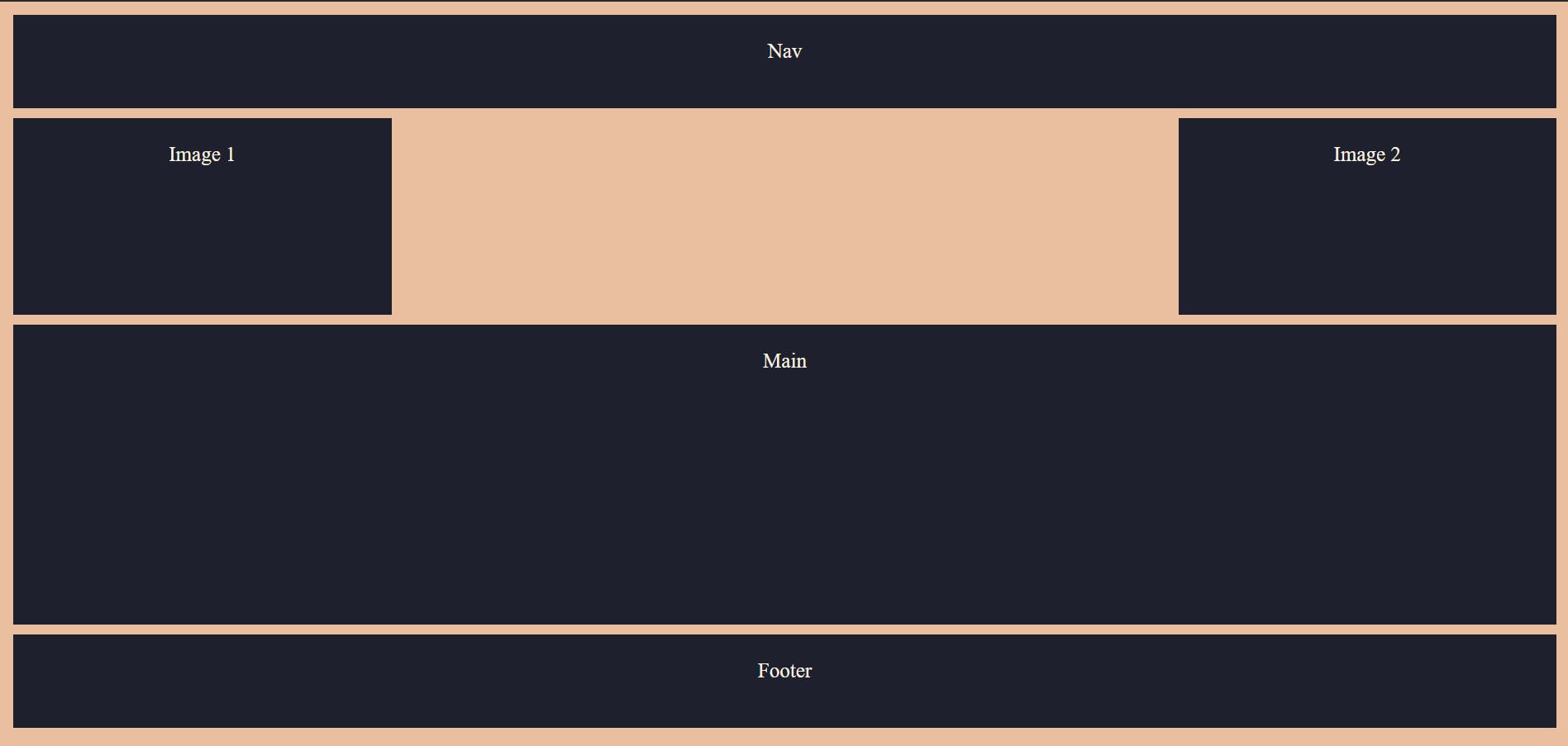
Suppose we want to increase the row height, we can do so by modifying the grid-template-areas as follows.
.container {
  display: grid;
  grid-template-columns: repeat(4, 1fr);
  grid-template-rows: repeat(10, minmax(100px, auto));
  grid-template-areas:
    "nav nav nav nav"
    "img1 img1 img2 img2"
    "img1 img1 img2 img2"
    "main main main main"
    "main main main main"
    "main main main main"
    "footer footer footer footer";
}
You can add any number of rows by simply repeating the lines in grid-template-areas.
Output :
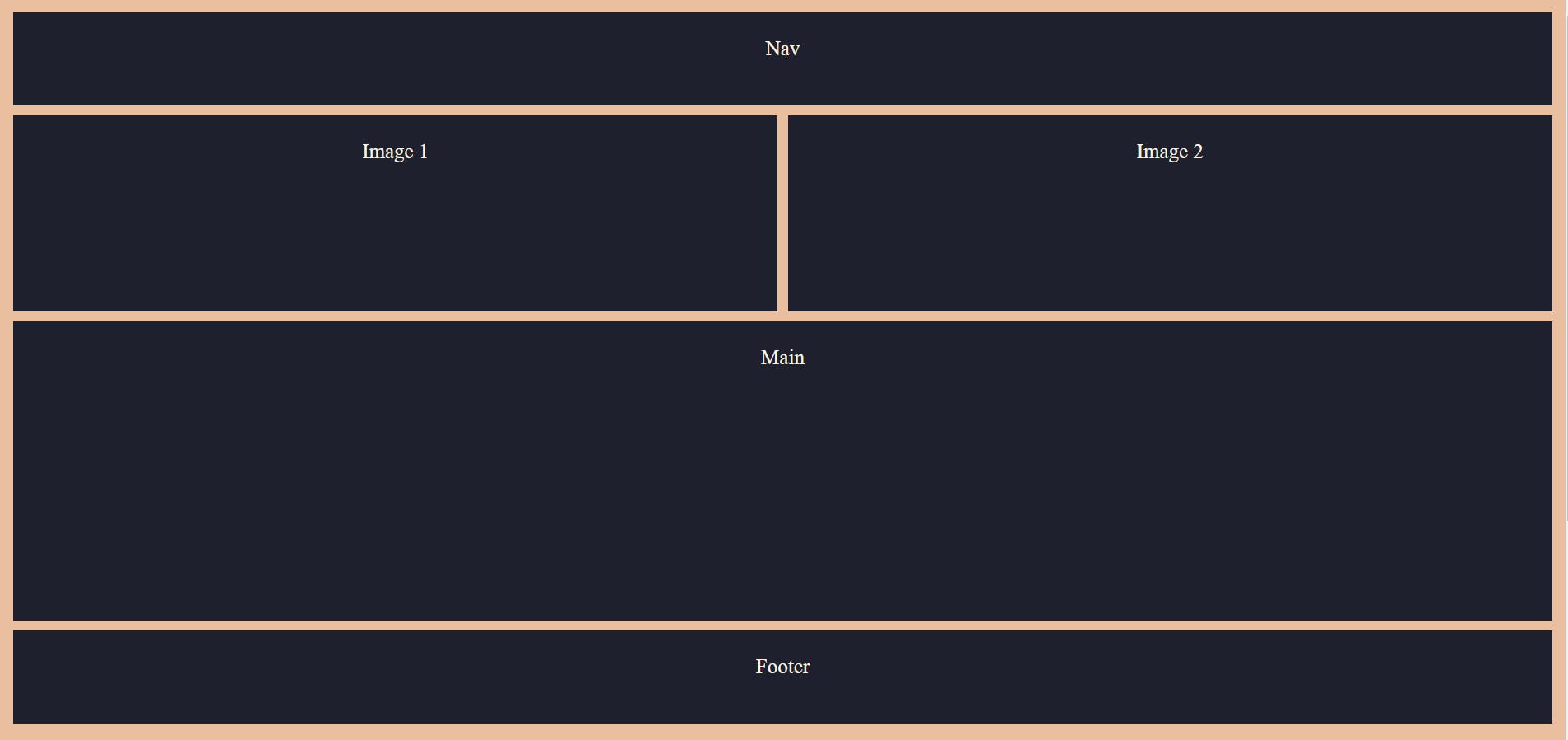
We can also leave spaces in between the elements as follows:
.container {
  display: grid;
  grid-template-columns: repeat(4, 1fr);
  grid-template-rows: repeat(10, minmax(100px, auto));
  grid-template-areas:
    "nav nav nav nav"
    "img1 . . img2"
    "img1 . . img2"
    "main main main main"
    "main main main main"
    "main main main main"
    "footer footer footer footer";
}
Output of the above code:
The real power of CSS grid comes into play when we have to design responsive webpages. Responsive design is a graphic user interface design approach used to create content that adjusts smoothly to various screen sizes.
We can make use of basic media queries along with grid properties to make our webpage look good both on desktops as well as mobile phones.
Consider the following updated HTML and CSS codes
HTML :
<body>
    <div class="container">
        <div class="nav">Nav</div>
        <div class="main">Main</div>
        <div class="img1">Image 1</div>
        <div class="img2">Image 2</div>
        <div class="aside">Aside</div>
        <div class="footer">Footer</div>
    </div>
</body>
CSS :
.aside {
  grid-area: aside;
}
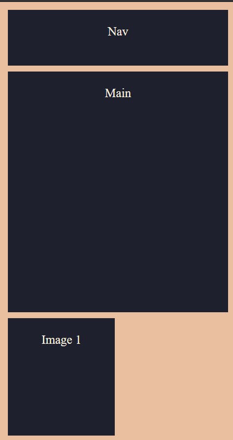
Let's use @media screen property to enable responsive design.
@media screen and (min-width: 400px) {
  .container {
    display: grid;
    grid-template-columns: repeat(2, 1fr);
    grid-template-rows: repeat(12, minmax(100px, auto));
    grid-template-areas:
      "nav nav"
      "main main"
      "main main"
      "main main"
      "main main"
      "img1 . "
      "img1 . "
      " . img2"
      " . img2"
      "aside aside"
      "aside aside"
      "footer footer ";
  }
}
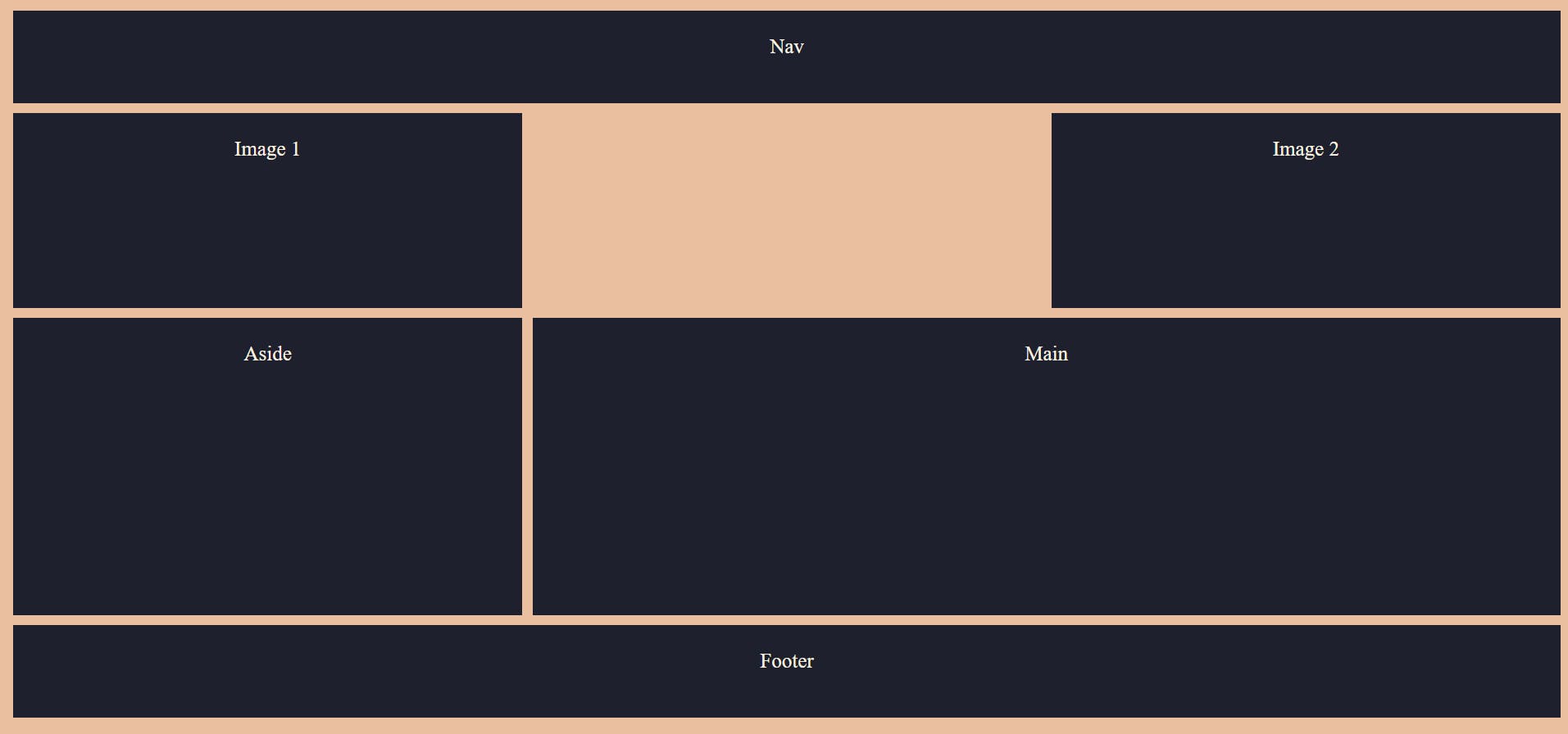
The above code is for mobile design and the below one is for desktop design.
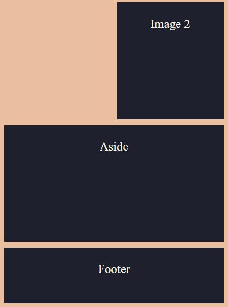
@media screen and (min-width: 800px) {
  .container {
    display: grid;
    grid-template-columns: repeat(3, 1fr);
    grid-template-rows: repeat(7, minmax(100px, auto));
    grid-template-areas:
      "nav nav nav"
      "img1 . img2"
      "img1 . img2"
      "aside main main"
      "aside main main"
      "aside main main"
      "footer footer footer";
  }
}
Desktop output :
Mobile output :
CSS grid vs Flexbox
Flexbox is one more popular CSS 3 web layout model introduced in 2009. It allows responsive elements within a container to be automatically arranged depending upon screen size.
Flexbox is a one-dimensional layout system. This means we can create either a column or a row axis layout. You can just give a display: flex property to the container and use flexbox.
So, when to use what?
Use flexbox when just need to align items and have a small design to implement.
Use CSS grid when there's a complex design to implement and have to overlap the elements.
CSS grid is mostly for the layout whereas flexbox is for alignment.
That's all for the CSS grid system. Explore more of CSS grid layout designs by reading documentations if interested.
I have tried covering many of the concepts. I hope you have liked all the three articles and have learnt from it.
Keep Learning...
- Maneesh